One of the main powerful historical figures of the Rococo period was Madame de Pompadour, a woman born not of royal blood, but whose beauty was enough to captivate King Louis XV to ensure that she was made his official mistress, and whose intelligence allowed her to control his kingdom from behind the scenes. Soon after becoming his mistress, Jeanne Antoinette Poisson was given the title of Marquise so that she could appear at the king’s side in court. Even after finishing their romantic relationship not many years after it began, she managed to stay within the good graces of the king and his queen allowing her advice and involvement in several large diplomatic relations, including the treaty of Versailles. To ensure her lasting beauty she commissioned several paintings of herself. Boucher’s 1750 portrait is very reminiscent of the “rococo” style we are all familiar with, with lavish detail and attention paid to her extravagantly beautiful dress and the furnishings of the room behind her.

Poisson’s good taste ensured Frances position on the cultural map, and made it a hub for bustling artistic activity. Her influence was probably felt by a young Rose Bertin as she grew up surrounded by the decadent beauty of rococo. Upon moving to Paris to become a milliner Bertin grew in popularity steadily due to her ambition and good connections until she met Marie Antoinette and became the official “Minister of Fashion” in 1772. Her almost ridiculously ornate and elaborate creations were works of art, but unfortunately helped in driving France to its knees, but for a while, large contouches and powdered wigs were the height of high fashion. Bertin’s influence however can still be seen today, even if they are amongst somewhat niche subgroups of fashion. Along with the more famous Victorian bustles, Rococo helped influence the modern elegant Goths, as well as the more elusive Japanese Lolita fashion.


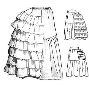
One of the most obviously influences in Lolita would be the petticoat, whether that be A line inspired by the crinolines of the 1860’s;


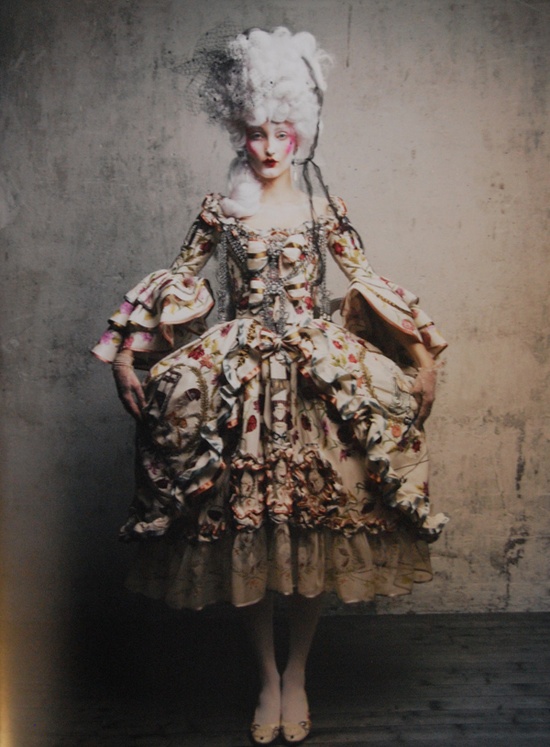
Or the large hips / double bustle of the rococo age:


And even the smaller bustle of the late 19th century has it’s place in elegant gothic aristocratic Lolita:
Full length rear bustle


Here’s one I made earlier…

Aaaaand here’s the dress I made for prom…
(Sorry, shameless self promotion over.)
Also popular are bloomers, drawers and bonnets.


There always seems to be a bit of controversy floating around Lolita fashion, mostly to do with the associations with Vladmir Nabokov’s novel, which is unfortunate, because this causes people to jump to conclusions concerning promiscuity and sexualisation of young females very quickly, when in reality it couldn’t be further from the truth. Most Lolita’s wouldn’t be seen dead in a dress which could be even considered risqué, so it seems unfair that we are landed with such a label when there are people out wearing much shorter skirts.
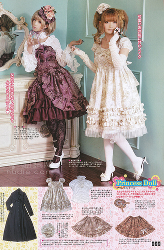
Pictures from the Gothic & Lolita Bible, note that skirts are below knee length
Not that short skirts are even the problem, you want to wear one, you wear one, and I respect you for your choice. But, even if your skirt is a little short, that’s why people wear petticoats and tights; there is physically no way any Loli should be in any danger of flashing. In regards to the sexualisation of young girls, that is purely based on the novel which as previously stated bears no resemblance to the fashion. Lolita is about emulating Rococo / Victorian wear, and looking as doll-like as possible, it isn’t age play. And finally, in terms of being over sexualised, most of the people saying this seem to be unable to grasp the concept that we dress this way for ourselves. Because we want to. Because we can. Not everything adorned by a woman is for the benefit of a man, contradictory to society’s beliefs, and once people start realising this there will be far less problems concerning “male entitlement”. The whole ideal of rape culture has a tendency to revolve around the statement “they were asking for it.” and this contradicts completely with the definition of rape. They were not asking for it in any way shape or form, they were wearing the clothes they chose to put on because they wanted to, and certainly not for the benefit of someone that would wish them physical and psychological harm.
There needs to be re-education. We should be teaching “don’t rape” instead of “don’t get raped”.

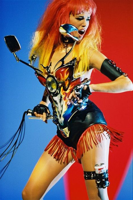
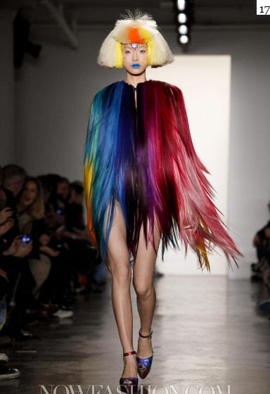
Kyary Pamyu Pamyu


![Gaddi- Madonna Enthroned with Saints and Angels [middle panel] 1380-1390](https://lmclaughhome.files.wordpress.com/2013/11/agnolo-gaddi-1380-90.jpg)


